MICA Sustainable Graphic Design


Sustainable Design

Alexandra Petrenko, Chris Corey, Claire Evans, Dayanna Centeno, Devin Halladay, Greg Fisk, Harley French, Katie Mancher, Kevin Guyer, Kristian Bjørnard, Ruyin Lin, Risa Benedyk.


Contents


A Student's Dilemma

Chris Corey

A few months ago, I signed up for a sustainable graphic design course because I wanted to learn more about how the discipline impacts the environment. But the class made me rethink more than just my approach to graphic design. I discovered zero-waste lifestyle blogs (1,2,3), several videos on YouTube (1,2,3,4) showcasing innovative approaches to sustainable living, and realized that personal consumption and waste also played an important role in my design practice. The waste I was generating in my personal life far outweighed the negative impacts of my current design practice at MICA and likely feed into my unsustainable approach to graphic design. I decided I needed to think about things more holistically. If I developed a sustainable design practice but didn’t do anything to improve my lifestyle I feared that shortly after the course ended, I’d simply revert back to old habits and none of these sustainable values would stick. It also seems very unlikely that I’d be a good champion for sustainable graphic design in my professional practice moving forward, where clients and project constraints often create serious barriers to a sustainability, if I’m not willing to put in the effort to try and live sustainably at home. So, for the classes final project, I decided to try and drastically reduce my waste (inspired by zero-waste lifestyle blogs) and document the experience. Along the way, I also tried applying sustainability to aspects of my thesis project. The following is a reflection on that experience.

RESEARCH

The biggest resource for our class was the Sustainability reader. It contained several (#) essays on sustainable design along with a helpful collection of list, charts, and manifestos that created an overview for how we could approach sustainability in our own practice. In addition to that, I also did a good amount of my own research and found a lot of inspiring blogs and YouTube videos that helped me think about how sustainability could influence my personal life. Zero Waste bloggers were particularly helpful throughout this project because they provided so many simple alternatives that help me cut back on or completely avoid sending anything to a landfill. I found this zero waste outline and I’d recommend it to anyone looking to live a more sustainable lifestyle.

1. Establish your “why”

I’m trying to develop a lifestyle and if my everyday actions are more in line with sustainability, I believe it will it naturally start to influence my design practice.

2. Where did most of my waste come from in the last two months?

It came from the kitchen! Paper towels, plastic wrappers, food packaging from the store or delivery services, and food scraps make up most of the trash each week. In addition to that, there are some small items from the bathroom and cat litter.

3. Prioritize

  1. Food/Kitchen Related Waste
  2. Design Related Waste
  3. Cleaning/House Waste

4. Replace Items as they run out & properly recycle / compost items

This step is important! I wanted to cut back on my trash production over the month, but there were still plenty of unsustainable products in my house. So, do I just throw all off that away, so I can start off with a clean slate? No! Since I already bought the paper towels, and the tooth brush, and the packaged cleaning supplies, etc. I just need to use them. It doesn’t make sense to get so wrapped up in only using reusable products that you just throw away everything in the house that doesn’t fit into your long-term plan. But with this in mind, it’s important to highlight that I produced a fair amount of trash compared to the zero-waste lifestyles I was inspired by. But that’s OK, it’s a process and it’s something to work towards overtime. I’m about to run out of a handful of products that I plan on replacing with sustainable alternatives and I’ll keep getting better over time. Don’t expect to jump to practically zero-waste overnight.

Here are some other resources that helped me throughout the month.

Baltimore recycling information
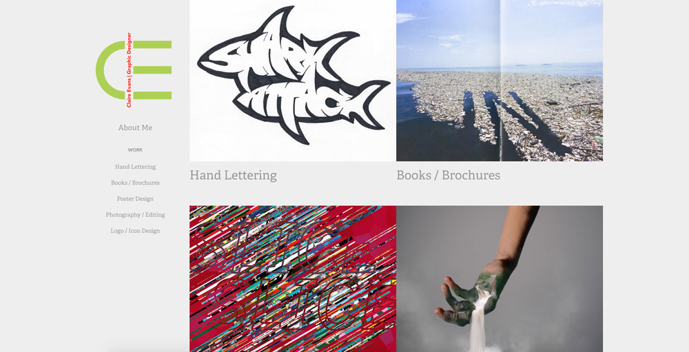
MICA Sustainability Office

Mom’s Organic Market

GRAPHIC DESIGN

  1. Web Design

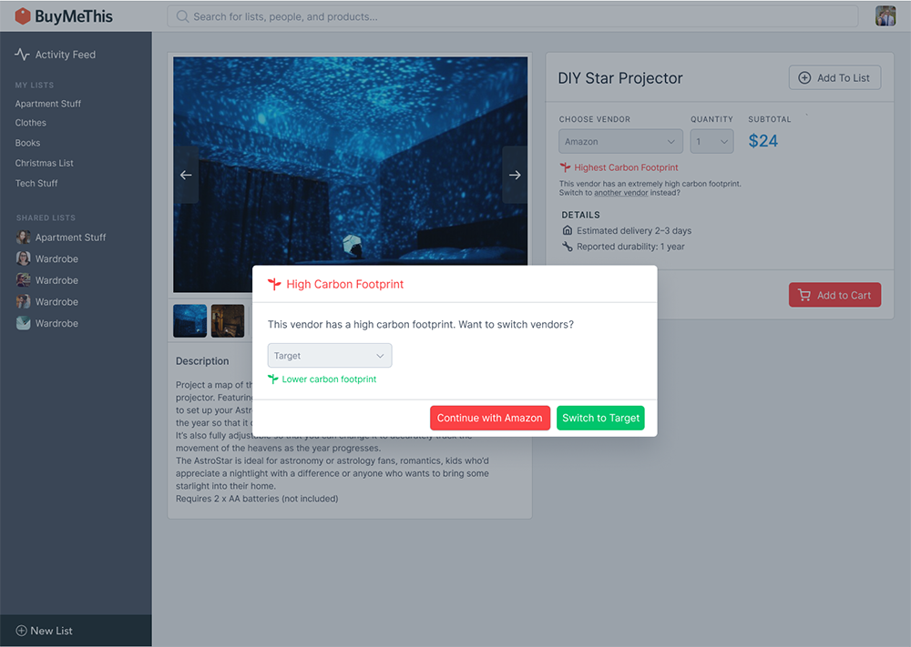
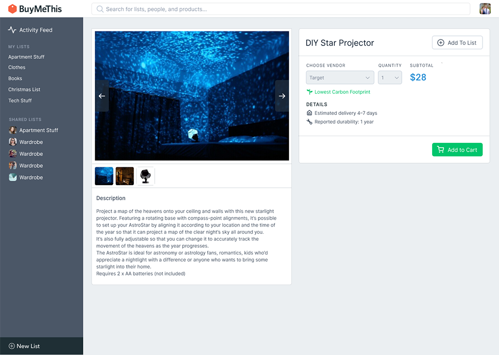
Inspired by this solar powered website and the principles they laid out I tried designing a website for my thesis project using as little as code as possible with no unnecessary content. The site works, but in it’s current iteration, it feels really undesigned and I might need to keep playing with it. Currently it feels more like I didn’t do anything, as opposed to intentionally designing something to use less energy. There is nothing about the design or function of the site that helps users know that the site is trying to be sustainable.

Is this really a problem? If the site is too simple and no one winds up using it, is it a failure? I would argue yes. The goal of the project isn’t to be sustainable. The project has its own objectives and achieving them in a sustainable fashion is an additional challenge. There needs to be a balance and I’d imagine that this will be different for every project. On the other hand, you could make the argument that if there isn’t a way to make the project work sustainably, then you should just not do the project at all. This approach also varies greatly depending on how hard core you want to be about defining sustainability.

  1. Thesis Exhibition

Thesis Exhibition

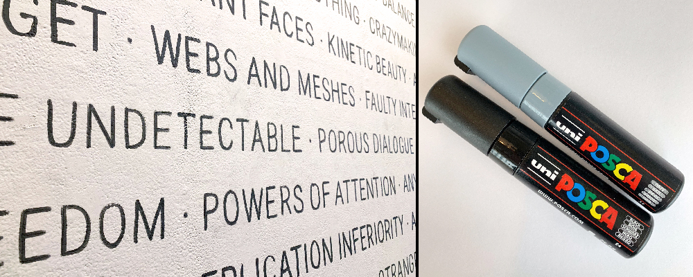
For my exhibition, I avoided vinyl on the wall by using a paint marker and projector to get a large amount of typography on the wall. This took about four hours to get done, it was easier than actually dealing with vinyl and it gave the wall a more unique appearance. This felt a bit risky in the moment, because I had never used this method before and if it hadn’t worked it would have put me in a serious time-crunch. I did a few test in advanced and planned out my approach and luckily it all worked out. In the long run, this is a small change and it probably won’t work for everyone’s exhibition needs, but it was a nice example of sustainability can push your practice in new directions.

SUMMARY

I wanted this class to have a lasting effect on my practice but as it comes to a close, I’m facing the fact that sustainability isn’t a destination you reach after a few months of work. It’s a daily challenge to push back against deeply ingrained habits that champion convenience and comfort, and I’d be lying if I told you there were never days when old habits got the best of me throughout this project.

My hope is that by sharing this information it might encourage students to take an honest look at their trash and think more about how they can live sustainably in their personal life as well as in their design practice.

A Sustainable Publication

Dayanna Centeno

1.Why did you pick this project to improve? I picked this project because I wanted to keep experimenting with an expressive publication in a sustainable way.

2.What were you trying to sustainabilize? I tried to sustainabilize the use of ink.

3.How did you go about analyzing your project for possibilities? The original goal was to use sustainable ink. My first approach was to create a sustainable colored paper that resembles a sticky note. I found online recipes that explain how to get sustainable ink from vegetable and fruit pigments mixed with vinegar and water. I thought about using the potato stamp technique. For the text, I was going to use sustainable ink and the typeface PIN from the Colophon Foundry website. This approach was going to be very exploratory but time-consuming as well. I decided to explore new ways to make this project sustainable without using ink. I used the same typeface-PIN as my inspiration for the typeface created without ink. I hand draw the letters. Then, I hand cut circles around each letter. I put a different colored paper under the paper where I hand cut the circles. The intention was to create a contrast between the second layer of paper and the first layer of paper where I created the text hand cutting circles.

4.What questions did you ask? (what did you keep asking as the project progressed?) How can I do to find a way to make it less time consuming? How to create contrast on the paper so that is legible and readable.

5.Where did you look for answers? https://www.colophon-foundry.org to find a sustainable typeface. I also went to the deck library at MICA and borrowed the book: Eco books: Inventive projects from recycling bin for inspiration on the design of the book cover.

6.What did you learn? I learned a different way to display text without ink. I learned that we can be sustainable designers if we think outside the box.

7.What resources did you find? I found sustainable typeface options. Before taking this class, I did not know about the existence of sustainable typefaces. Also, the deck library at MICA has a tone of books dedicated to sustainable design. (I liked Colophon Foundry for its dotted typefaces).

8.What do you know now that would have made your life easier at the beginning?(or what things that you figured out would be good to have given yourself when you were a first year or sophomore?) I learned that designers do not necessarily have to spend money printing or buying ink to display their work. There are other ways to be creative without hurting the environment, we just have to be creative enough to find a sustainable way to think outside the box.

9.What other projects or examples did you look at for inspiration? After I finished my sustainable project, one of my classmates told me about Annie Howe, a Baltimore based paper cut artist. She is a graduate of the Maryland Institute College of Art. Her paper cuts are used for a variety of projects including illustration, surface design, and three-dimensional work. I was excited to see all her sustainable work at her website anniehowepapercuts.com

10.Any images or in process examples you can provide? love focus makeangerangry process

Contingencies in Sustainabilitism

Devin Halladay

This essay is a reflection on the contingencies we must acknowledge and address as designers (and artists, engineers, accountants, whatever you are). I will reflect on these contingencies through the lens of digital product design, but the reflections I make apply to the entire domain of design (when I say “design,” I also mean many other trades, crafts, specializations, and domains of knowledge). But first, we’ll take a brief journey through the present state of the Internet.


Ted Nelson, a pioneering information technologist and philosopher who helped develop the directionality and ideological foundation of the early Internet, once wrote that “everything is deeply intertwingled.” Nelson continues, tearing down the notion of “subjects of study”:

“In an important sense there are no ‘subjects’ at all; there is only all knowledge, since the cross-connections among the myriad topics of this world simply cannot be divided up neatly.”

This notion of the intersectionality of knowledge domains led Nelson to invent the concept of hypertext, which is the foundation of the Internet as we know it today: an entangled mass of documents that link to each other using hyperlinks in order to form a network of knowledge, and ultimately, a network of peers, of real people.

Intertwingularity

Today, the Internet is broken. This is because of the planetary-scale centralization of power, resources, and attention into just a few repositories that lie in the hands of global sovereign corporations like Facebook, Google, Twitter, and Amazon. A new Internet is needed, and calls for this new Internet have been answered by projects like the InterPlanetary File System and the DAT Protocol — projects that aim to decentralize and dis-intermediate the web, reclaiming information, power, and attention from the hands of the central Internet powers.

The “intertwingularity” or entanglement of information in the world has been denied and slaughtered by the global Internet powers, which collect that information and force it into arbitrarily constructed ontologies, or structures. Accordingly, the interfaces through which we access and manipulate information have become centralized and turned into objects for the generation of capital — in short, interfaces and digital ontologies today exist not for the user’s well-being and the freedom of information, but for the accruement of dollars. Additionally, these interfaces obscure the inherent materiality of the Web: the mass of roots supporting it that consists of real people, submarine cables and fiber optics, rare-earth metals, plastics, and more elusive material activities like labor, resource extraction, server maintenance, and energy usage. This is unacceptable: it is an abomination to the technology and ideology invented by Ted Nelson and Tim Berners-Lee, the inventor of the World Wide Web.

The alternative, the horizon of hope, lies in sustainability.

Sustainability acknowledges inherently the intertwingularity of systems, things, people, information, and ideas. More than just “being green,” which is a shallow interpretation of sustainability at best, sustainability is an endlessly intertwingled set of actions and ideologies that work together to form a sustainable existence. Even more than that, sustainability is the way we respond to the collision of individual and collective actions with the material circumstances of the world. Sustainability is an activity, not a decision — it requires continuous action and inquiry. Sustainability is difficult to define, but I’ll give it a try: sustainability is the continuous act of questioning our contexts and acting in response to those questions in a way that maintains equilibrium in the network of forces that compose our contexts. Put more succinctly, sustainability is asking questions and answering those questions with actions oriented toward a balanced and enriched future. This is opposed to unsustainability, which can be defined as any activity that depletes resources and throws off the equilibrium of the contexts surrounding us.

Design is the ultimate substrate for sustainability. Design is the act of asking questions in order to solve problems within a set of constraints. All the way through, the design process involves questioning and acting, observing and responding. It is through this observation and response, which forms a dialectic whose synthesis is a design artifact, that design can become a model of sustainability.

The sustainable designer, and the sustainable individual in general, always considers a web of questions before acting on an intuitive or intellectual impulse. They question things in categories such as environmental sustainability, fiscal sustainability, and individual sustainability (physical and mental well-being).

This question-asking is a crucial step in the design process, because the questions asked work to form the boundaries of the solution space, or the domain of possible solutions to the problem, and in turn work to construct the form of the derived design artifact. If the questions asked include questions of sustainability, the derived design artifact will likely be more sustainable than otherwise.

In the context of digital product design, sustainability is a tricky thing to define, and the questions we ask as product designers are difficult to think up. During Kristian Bjørnard’s Sustainable Design course, I worked on redesigning aspects of a product I had previously designed for a client, to make the project more sustainable. The product is a social wish list application called BuyMeThis, where users can add products they want to lists and share those lists with others (for example, it could be used for a birthday gift wishlist or a wedding registry). I began the redesign process by asking myself the following questions:

  • What does sustainability mean in the context of this project?
  • How can the product be more individually sustainable, more mentally sustainable for the user?
  • How can the product be made more environmentally friendly through design decisions?

These questions led me to the final question that drove my investigation: How can the product encourage more responsible and sustainable consumption? This question led to a set of product/design statements and questions which were answered by a set of design decisions.

  • How can I encourage users to consume the application’s content more slowly in order to respect their right to attention sustainability?
  • How can I alter the functionality of the product in order to discourage unsustainable consumption?
  • What behaviors am I trying to encourage or discourage in order to make sustainability a primary feature of the product?

These are the features I considered altering or introducing as a result of those questions:

  • A suite of small features to discourage buying products from vendors that are known to have a higher footprint than others.
  • Website/store hours, just like a real store, to discourage people from shopping 24/7 and consuming server energy at unnecessary times.
  • A Product Durability metric exposed on product pages to help users choose products that they won’t have to throw away after a month of use.
  • A product-level sustainability score, based on data gathered from third parties and on combined heuristics for determining “sustainability” (like cost, durability, materials used, and packaging method).
  • A user-level sustainability score, based on the averaged sustainability scores of the products purchased by each user, that can be gamified and used to encourage users to buy more products that have higher sustainability scores in order to increase their individual score.
  • User bonuses like discounts and access to additional features based on their sustainability scores.

Ultimately I only had time to focus on the first two of those features: vendor carbon footprints and website hours.

Website Hours

Store Hours

In our era of hyperconsumption and constant attention, we’re used to thinking of wesbites as something ethereal and always-on: for reasons I suspect most of us have never considered, we simply expect all websites to always be online and functioning. But this is an unsustainable ideal. For reference, around 2% of global carbon emmissions come from data centers powering the web, a market of which Amazon holds over 40%. Amazon’s AWS (Amazon Web Services) hosts around 5% of all websites, which includes major players like Netflix, which accounts for 30–40% of all Internet traffic, depending on your source; additionally, over 70% of all Internet traffic runs through Amazon’s northern Virginia data centers at some point in its path. Amazon’s AWS infrastructure is composed of around 50% renewable energy sources as of January 2018, but a large portion of that energy comes from nuclear power, which is non-renewable but low-emissions. 30% of Amazon’s energy usage comes from coal. Statistics on Amazon’s actual energy usage and emissions are difficult to find, but according to the 2018 IPCC report, the world’s combined energy usage in 2017 led to 36.2 gigatonnes of CO2 emissions (that’s 36,200,000,000 tons); if 2% of global emissions come from data centers, that means data centers worldwide emit around 724,000,000 tons of carbon per year; if Amazon owns 40% of the data center market and uses 50% renewable energy, a very conservative estimate of their yearly data center carbon emissions is around 144,800,000 metric tons per year. That’s a lot of fucking carbon, and this estimate is most likely wrong and far too low.

Giving websites store hours not only makes running a website more environmentally sustainable, it also forces users to consume content more slowly and at regular times, freeing up their attention and making internet usage more mentally sustainable.

Vendor Carbon Footprint Warnings

High carbon emissions vendor

According to 350 Seattle and its sources, Amazon’s shipping operations in 2017 emitted at least 19.1 millions metric tons of CO2. This is equivalent to the average yearly energy usage of 2.9 million U.S. homes.

Some vendors have lower carbon footprints. For example, Target’s global shipping operations emitted only 2,982,884 metric tons of CO2 in 2017.

In an effort to encourage users to choose vendors and shipping options with the lowest emissions potential possible, I introduced several small features to discourage buying from vendors with high emissions rates. These features include:

  • Introducing small amounts of friction into the user experience when users try to buy from high-emissions vendors;
  • Warning users when buying from a high-emissions vendor, and reassuring users when buying from a low-emissions vendor;
  • Introducing a carbon offset fee (which I called an “Eco-Fee”) for users who still choose high-emissions shipping methods.
  • Making the default vendor and shipping method choices the lowest-emissions options so that users are more likely to choose them.

Friction for high-emissions vendors

Low-emissions reassurance


Sustainable Product Design

Ultimately, sustainable digital product design and software design is a relatively difficult concept to put into action. A major task of a product designer is to design an interface to a technology in order to make that technology accessible and understandable. But since these interfaces are so heavily abstracted from the underlying technologies, it becomes easy to forget that there is real materiality to our work. We’re not just pushing pixels and code, or just designing interfaces and icons; we’re also contributing to the global rare earth resource extraction apparatus, contributing to emissions by designing inefficient user flows that consume greater amounts of energy, and consuming labor and energy as a downstream effect of our work.

Product design’s extreme “intertwingularity” lends itself to an extreme amount of questions that need to be asked when designing a product responsibly and sustainably. Product designers need to be critical of their products and features, asking questions about their efficacy, sustainability, and usability. These questions can be hard to conjure up, because they often involve “unknown unknowns”, or the things we don’t know that we don’t know. Accessing these unknown unknowns requires research, patience, practice, and extended inquiry.

But these skills for accessing unknown unknowns and designing sustainably are not unique to product design. All designers have a duty to ask questions, to be relentlessly critical, and to perform thorough research. Sustainable design means designing things in such a way that they produce as little waste as possible, help to maintain equilibrium in the world, and push the world toward more equitable futures.

To bring this full circle, back to the broken Internet: asking questions and focusing on ubiquitus sustainability (that is, sustainability in all its facets: the environment, cost, the user’s attention, the designer’s energy, etc.) will lead us toward a better future where the software we use is not an imposition on us but a tool for our continued liberation and agency. Considerate, compassionate designers are what is needed in order to make this happen. To the reader, as you start your design and art practices, consider this advice as your point of departure: the world needs your criticality, intellect, curiosity, and compassion. Focus on growing those areas as much as possible during your time at art/design school. By the end of your time here, regardless of your approach and effort, you won’t know what art or design mean, or even how to practice art and design. But you will know something far more important: how to question, how to learn, and how to care.


Resources:

  • Ethical OS — A toolkit and set of questions for designers to ask in order to ensure that their products are sustainably and ethically designed.
  • Designing for Sustainability — Great article by UsTwo about sustainable product design.
  • Sustainable UX — Another great article, this time from Shopify, that contains a good overview of things to consider when designing a product with sustainability in mind.
  • Green Patterns — A pretty simple article that outlines a few tactics to consider when designing a sustainable product.
  • Ambient Product Design — A project by software designer Alex Singh that explores ways of designing compassionate products, which is a critical aspect of digital sustainablity.

  • Intertwingularity image sourced from http://www.cabinetmagazine.org/issues/13/rosenberg.php.

MICA Graphic Design Department Identity

Alexandra Petrenko

Brand identities rarely have sustainability in mind. They are meant to provide a cohesive “image” to corporate entities and be able to hold this image for a certain number of years until it goes out of fashion, usually to be replaced with another trendy direction. MICA’s Graphic Design Department often switches up their image every 2/3 years. Our department’s image is very unsustainable, but that’s part of the existing “brand” the department assigned itself: a brand that embraces change and subversion, be it for better or worse. If designed well, a brand can last as long as the entity exists (which could be for decades to centuries) – or the ephemerality can be embraced.

As designers, we often have little control and are subservient to our client’s wishes. However, with enough conviction, we can use this opportunity to educate. This term I was currently working on rebranding the MICA Graphic Design Department. Fortunately, I was given free range to do anything, provided I create signage and print collateral and connect the identity to the department’s ever-changing image. By creating this identity, I hope to bring to light that sustainable measures in designing a brand can exist and be substitutes as healthy alternatives to the status quo (alternatives to vinyl, etc.).

My first course of action is to set one, large restriction: no vinyl whatsoever. Vinyl contains a chemical called PVC (Polyvinyl chloride), which when discarded, releases mercury, lead, and cadmium, contaminating soil and water sources. PVC is not degradable and retains its form for centuries.

Vinyl is in every way convenient as it is toxic. Vinyl can be used for good, especially as permanent signage (since it sticks so well to most anything and degrades so slowly), but we often use vinyl lettering for exhibitions lasting no more than a month or so. Considering that the MICA GD identity is mostly signage and print-based, figuring out how to redirect signage into other mediums was a crucial first step.

Intro: 2017–2019

The previous identity was based on the revitalization of Hobo, a typeface that over the years became an often maligned typeface that slowly degraded in credit and appreciation within designers. This is mostly due to the change of tastes in recent years from one-hit/display typefaces to more malleable ones. James Edmondson, typeface designer, made a new typeface called “Hobeaux” to challenge and revitalize and modernize the “glory” of Hobo’s unnatural but unique curves.

2017–2019 Signage 2017–2019 Signage2 2017–2019 Collateral2

As you can tell from these photos, this identity didn’t reconsider vinyl; in fact, it might’ve embraced it too much to the point of overindulgence. The accessory of the added borders around all signage and collateral added more to the identity of Hobeaux, but is too superfluous. Don’t think of Edmondson’s design as inherently terrible–far from it. But it does consider the aesthetic more so than the underlying consequences of designing something as complex and rendered as his typeface and identity.

2017–2019 Collateral2

Consideration: 2019–???

Main signage Deconstruction of "Giza" typeface

In order for the brand to connect to the larger scope of the school, but also play on the idea that the department is subversive, I took MICA’s iconic “Giza” typeface and took apart the letters. I then reconstructed the pieces into an entirely new typeface, playing into the idea of reusing and repurposing digital materials. By doing this, not only does this create interesting opportunities for modular type, but also give form to pattern-making, iconography and wayfinding (arrows). Large stencils were fashioned so the lettering can be used as a form of permanent signage for the floor.

Alphabet

This new typeface is called “Maker Giza,” playying on the new role of “designer as maker.” The notion of a “maker” is rooted in traditional crafts and practices, which is what “Maker Giza” aims to do through its subversion of signage and typographic treatment.

Stencil outline Stencil outline2 Type Specimen

Figuring out the signage naturally led into creating a typeface in order to maintain consistency for print deliverables. Choosing the body text came down to convenience, conservation of energy and accessibility. By choosing the default typeface native to InDesign and Illustrator, typefaces like “Minion Pro” and “Myriad Pro” can be used by anyone, anywhere with Creative Cloud. Not only do these 2 typefaces (especially “Minion Pro”) offer a wide number of weights, they also compliment the modular “Maker Giza” typeface with their humanistic undertones.

It might not seem as though choosing typefaces is something to be “sustainable” about, but we often forget that saving time is just as sustainable as conserving materials and energy. Sustainability doesn’t necessarily equate to resources but rather sustainable design practices and productions. Our main resource is time, and if there is a way to save/conserve time, then its sustainable. Typeface choice is mainly arbitrary other than for aesthetic differences. Removing this process would clear time to conserve energy for more important tasks (or just to finally relax!).

Flyer Mockup

Beyond the Identity

Of course, what I’ve showed so far is just one out of a many possible permutations that goes along with the “Maker Giza” brand. The alphabet I’ve showed is just one alteration of the shapes. It allows for different typefaces for different applications. This brand is designed to be a kit of parts for anyone to use how they see fit. Any letters designed from these stencils are acceptable forms and are therefore part of the brand. Calling for active participation, this identity is meant to bend and change to how the designer sees fit.

Type Specimen Separated

The identity extends into other uses as well, some that would otherwise not be considered in a standard identity redesign. In this instance, the designer/promotion posters posted right outside the department consume a lot of tape and paper; is there a way we can diminish the impact? If we had to use posters, is there a way to not use tape? An alternative I came up with is to use paper corners as a means to hold the paper in place, with the only tape being used is securing the corners to the glass.

But let’s go even deeper; how about not using paper at all? How can we create a poster without using paper? An alternative would be to use the glass of the building as “paper”, with the designer drawing/writing the promotion (you’ll see below that I’ve added tape as guides for the heading, place, time, etc). Stencils could also be used as pattern-making or to even create letter forms, but not necessary.

Designer Poster Alternatives

Another example of going beyond the identity includes what the department’s work study interns are familiar with: the walkthrough sheet. This is used maintain the department, but can we improve the workflow of this? The current walkthrough sheets are laminated and use dry erase markers to write and check off what we accomplished. Compared to previous walkthrough sheets, which were just sheets of paper that were soon discarded, this year’s walkthrough sheets are a vast improvement. But can this be pushed even further? An alternative is to use binder clips instead as a means to check off tasks and even detail who’s cleaning, the date, etc. This way, we save on dry erase markers, cleaning solutions, towels, etc, and use these materials for a better purpose: the promotional posters.

Walkthrough

Future Developments

By the time this will be published, more developments will be made to the identity. Who knows, maybe you will see it being used in the coming months! But as of writing this, it is yet to be determined.

Designing a Compostable Book

Kevin Guyer

I was approached by a duo of Design Leadership MA students to realize their concept for a plantable workbook about managing grief. It quickly revealed itself to be much more complicated of a project as originally thought—it COULD just be be regular paper with a generic seed-paper cover, but it could also work through many relevant considerations: does regular paper have bleaching elements that would be toxic to soil Would the seeded paper introduce an invasive species? Could the amount of content be reduced without losing its effect? To the extent possible, I addressed each of these concerns to arrive at a well-considered end result.

Main book spread

An internal spread inviting the reader's action

Reducing unnecessary content

The first step was editing down the lengthy amount of written content—a good amount of it was unnecessary to the piece as a whole, and for an object that needs to fully decompose, less material is optimal. The original makers of the book were totally open to having the book edited, which helped a lot. Once I removed content that wasn’t necessary to the overall theme of the book (managing grief in a healthy and productive way), I began researching how paper decomposes. This book—‘Root and Branch’—is intended to be planted after working through it, and will grow something new in return. A beautiful metaphor. However, for that to happen successfully, the paper has to be just right.

What goes into a piece of paper

For a conventional piece of printing paper, a mechanical bleaching process (called ‘brightening’) takes place to produce the crisp, white sheet we all expect. This is mostly brought to fruition by mixing the paper pulp with hydrogen peroxide and sodium dithionite. These two compounds together prohibit the makeup of the pulp from absorbing visible light, keeping the paper bright for longer. Mechanical bleaching is better than it used to be—conventionally, chlorine was used, which is efficient. But produced with a bright piece of paper were chlorinated dioxins which are recognized as a ‘persistent environmental pollutant’ and cancerous to humans.

On the opposite side of the spectrum, newsprint can either be manufactured with recycled paper fibers or may be created with fresh timber. Both options involve turning the wood or fibers into a pulp, then dried. No bleaching, which gives it the distinct light gray shade associate with newsprint.

The result is a lightweight paper with minimal embedded-energy and use of chemicals. For a book that needs to hold up during use, then easily decompose: newsprint is perfect.

Ink & printing considerations

Regular, petroleum-based ink contains a high amount of ‘VOCs’—volatile organic compounds. These can be carcinogenic and toxic to ecosystems. In the case of this book, the ink is very important because it has to be buried into soil—and toxic ink would not be optimal. Vegetable-based ink is a great solution because not only are soybeans and rice bran renewable resources, but the colors are reported to be brighter and more accurate than petroleum-based ink.

Utilizing a Risograph to print the books is perfect: it is energy efficient, while rapidly printing many copies, and uses rice-bran ink. The Risograph works by burning a master copy of a single page and rapidly printing copies by the use of a single-color ink drum.

Book setup diagram

Book materials and packaging

Design decisions

For a book that relies on inspiring writing prompts, the typography is important. I selected Domaine Text Light, a thin serif with a natural, sensitive feel. Anything that isn’t a writing prompt is typeset in the normal style of the font, while prompts are set with an underline—indicating the griever’s action.

The book arrives in a reusable kraft paper envelope, and comes with a charcoal stick to write with. Including the charcoal stick not only avoids the use of a toxic ink pen, but acts as a fertilizer once the book is planted!

Conclusion

After this significant amount of research,’Living Grief’ is now ready to enter production. We will print the internal pages with the Risograph, and use a wholesale seed paper manufacturer for the cover. ‘Seedlings’ offers a variety of seed types, one of which is Black Eyed Susan—perfect for initial distribution in Maryland.

Can’t wait to plant the first copy and watch new life grow!

Designing a Low-Energy Portfolio Website

Claire Evans

I started making my own portfolio website on Adobe’s portfolio feature, thankful that I would not have to spend more money on a domain and server account, as well as the already coded templates—simple and easy. However, I know very little about the ways of the web, the way that you are supposed to optimize images to decrease the file sizes, and the way the servers have to send information back and forth constantly in order to load content onto a site. So, I embraced my large images, ability to put as much content as I would want on the site, and the amazing animation features that work throughout the site that would be difficult for me to learn myself.

##The Issue With Online Template Websites

This is also the case for all online website makers: Squarespace, WordPress, CargoCollectiv, Wix, Weebly, GoDaddy, etc. They make it too easy to be unsustainable. You get unlimited, automatic animation effects that takes power to sustain. It’s easy to upload as many pictures and content as you would like. Templates are set up so we don’t have to worry about designing it ourselves. Best of all, it looks like all the rest of the websites on the web, and it is quick (heck you could have a working website in an hour). But is this really the best option? Learning to code and design on the web makes you aware and appreciate what is on the web; it can be pretty difficult to code, and it allows you to decide what is really important to put on a website. However, automatically going to the easiest options means we are unknowingly uploading images that are 4MB large, and putting content on a site that does not need to be there, and even creating a site that did not need to exist in the first place. Where is all of this information stored? On a server who knows where with hundreds or thousands or tens of thousands of other websites and their loads of data and content. And what powers those servers? The same thing that powers our electricity: natural gas and coal.

This is also the case for all online website makers: Squarespace, WordPress, CargoCollectiv, Wix, Weebly, GoDaddy, etc. They make it too easy to be unsustainable. You get unlimited, automatic animation effects that takes power to sustain. It’s easy to upload as many pictures and content as you would like. Templates are set up so we don’t have to worry about designing it ourselves. Best of all, it looks like all the rest of the websites on the web, and it is quick (heck you could have a working website in an hour). But is this really the best option?

Learning to code and design on the web makes you aware and appreciate what is on the web; it can be pretty difficult to code, and it allows you to decide what is really important to put on a website. However, automatically going to the easiest options means we are unknowingly uploading images that are 4MB large, and putting content on a site that does not need to be there, and even creating a site that did not need to exist in the first place. Where is all of this information stored? On a server who knows where with hundreds or thousands or tens of thousands of other websites and their loads of data and content. And what powers those servers? The same thing that powers our electricity: natural gas and coal.

Other than the fact that these programs can be environmentally unsustainable, they also inhibit the ability to make more custom, creative, and interesting websites. Starting a website from scratch means that I can decide if the content is left, right, or center justified. I don’t have to conform to the basic notion of what a website should look like and do. I can control where the captions will go, where the images will go, what will become a button.

The most irritating thing that I found about those websites was that there was a particular design choice that I wanted to change, and I could not change it. Yes, of course this takes time and knowledge, but it is important to understand the efforts that go into building a website, and it will help you to analyze what is and isn’t important.

Having an online portfolio as an artist nowadays is a given. But think of all of those artists that have their own websites that are jammed packed with large images and content just like mine; it ends up consuming a lot of energy and space on internet servers. If every artist were to carefully consider their footprint on the web, we might end up saving a lot of energy in the end.

##Online Portfolio Considerations

Original portfolio website

My goal was to create a more sustainable, less energy consuming website, and in order to ensure it would in fact be more sustainable, I had to code it myself.  Content needed to go down. For starters, I had to think more philosophically about the point of the portfolio website. What do I absolutely need to include? What can I take out? Who are my viewers, what are they looking for, and what do they need to see? The people looking at my website are people that I am specifically applying to for an internship (or job in the future). They want to see my work and my abilities. They are people not trying to find someone to commission work which is why I got rid of a contact page and about me page. I can explain the “about me” section in my cover letter to them or in an interview with them. It was not necessary, so I replaced it with a small list of my skills—the necessary barebones. And down the line if I feel that I need it, I will add it in.

Portfolio website   Additionally, I wanted to create a single scroll page because this would eliminate the need to click from page to page within a site, saving the servers from having to send information back and forth, over and over again. It would take one load to view the entirety of my site.  The element that takes the most energy to load are the pictures on the site. In my previous portfolio, I did not understand that it mattered what the file size of the images were, so I optimized my images to get them all below (except for a few and the GIF files) 100KB.  The time it took to load my site decreased significantly. I also paired down the number of images to my most successful pieces. Although I am very proud of my drawings that I created, because they do not serve much in reference to building a graphic design portfolio, I removed them from the site.

Portfolio website

##Design Choices   Before I began coding, I thought about the fact that when I code I often fiddle around change stuff, and keep trying different scenarios of code through trial and error. This process in of itself uses energy and time that did not need to be wasted. I instead planned my code visually first on paper, then wrote down the code I would need to write in the HTML and CSS. When I opened visual studio code, all I had to do was copy it in. I also thought of ways I could use the least lines of code. All the elements were treated as a body instead of individually. I left many of the elements in the places HTML naturally places them, and used simple coding to make it visually unique. I did not link any fonts to the code, sticking to the default Sans-Serif font, and I used only two colors.

Portfolio website   I actually found it challenging to find examples of low-energy sites, and if they were supposedly low-energy there was no indication or explanation of them being low-energy. A real inspiration was Kris De Decker’s unattainable (at this stage) solar powered website, and a few single-scroll online portfolio’s that I found.

  • https://www.dbworks.pro/
  • http://ovefelt.se/
  • http://www.tvrdek.cz/en

##Visible Changes

When I inspected both of my sites, I could actually see the impact that my new site had on decreasing energy. To experience my new coded portfolio site, it took one load of 141ms (which is a really low amount). In order to load my previous website, it took 700-900ms per page click, and there are seven different pages to load to view all of the content. Though this project may seem minutely impactful in the grand scheme of sustainability, if everyone were take this approach, it would make a large-scale difference. Of course, visual aesthetics might be more important to someone, and that does not have to be disregarded—just being mindful and designing with this understanding is what counts.

##In Conclusion

I personally know very little about coding, and have only been coding for two months, but I successfully created my own website. This is to say anyone else can do it too. I even paired down content and other web design elements. It surprisingly is not too hard to make a site look similar or the same to that of Squarespace’s templates with limited knowledge of coding, however, I decided to make it look different and paired back for the sake of having a smaller footprint. That is to say, I took a more extreme approach and made design decisions that arguably isn’t actually necessary. That is left open to consider. But it is important to take the extreme approach to see how far you can take it, and ease up if necessary.

Ground Up Sustainability Design Update

Greg Fisk

Why did you pick this project to improve?

School projects often ignore real life implications that arise through the process of making and implementing. It’s easy to dream too big, deeming your work unachievable in the context of real life. For my project I wanted to take a school project and turn it into something achievable. Something I could actually produce and share with the world beyond my portfolio.

what were you trying to sustainabilitize?

My initial project was to create my own imaginary art school. As you can imagine, it would be easy for me to blow this idea out of proportion. I first imagined what it would be like to create a contemporary hip-hop school that functioned like the Bauhaus. A physical space where students would learn within utilizing a very methodical curriculum. It was called Ground-Up and involved a physical space built in impoverished neighborhoods where students would have the most benefit. I designed a school curriculum, came up with a book series and different projects the students would participate in. It was all great, but in the end, lacked real life implications of anything I could actually produce. This left me with a goal, how could I make something easily accessible to all?

how did you go about analyzing your project for possibilities?

After considering all the different parameters of what a school is, and considering the fact I wanted to actually make this thing real. I started considering what tools I could utilize at school. I thought about the different tools and techniques people use to learn, who my target audience is, and what I could do that hasn’t been done before.

what questions did you ask? (what did you keep asking as the project progressed?)

Who is my target audience? What makes the most sense in the context of hip-hop as a platform for learning and teaching? How can I use minimal resources? How is a school defined? How can this feel authentic to hip-hop culture? What can I do at MICA? How can I utilize the curriculum of my other classes to cross pollinate into this project. In other words how can I steer all of my classes to help benefit my interest in this idea and focus my energy on making something meaningful? What are all the different ways you can achieve a goal and what is achievable? What makes my solution the best one? Who will be reading the zine and what is the end goal? What do you want sophomores to read to understand? How can you conceptualize your work to be more sustainable? How can this lead to a more sustainable process in your work making in school?

where did you look for answers?

I scoured the internet, read books, went to b-boy practice and asked my community. I tried to identify innovative learning methods that utilize technology, in turn, minimizing resources. Identifying as a b-boy since the age of 14, I thought about how I learned. I looked at my favorite albums and analyzed the visual language of hip-hop. I thought about what hip-hop means to me and what it could do for society.

what did you learn?

I learned that hip-hop is best learned in your home, and out in the community where it flourishes. You learn by going out and being an active participant in the culture. Resources for learning should encourage students to seek knowledge by engaging and being an active participant in the conversation. Hip-hop gives an individual a sense of belonging and interacting with the outside world. I eventually decided I didn’t need an entire school at all. The most effective way to create a fun engaging introduction to different disciplines in hip-hop was to make something inexpensive, highly visual, and to act more as a call-to-action rather than something you study at home. For my project I wanted to think how each discipline could break down to a zine format printed using the Riso. The Riso website states “their digital duplicators and inkjet printers provide high quality, high speed printing with a lessened environmental impact than other printing technologies. RISO printers are among the most environmentally friendly printers on the planet.”

what resources did you find?

There are a lot of youtube videos, documentaries, and books on hip-hop. I also have a lot of friends that are more knowledgeable than myself and anything I could find online. It was helpful to reach out to them and share stories. MICA had a couple Riso printers I could utilize as well. Through this project I was able to find the training that I needed to complete my project. Here’s one of the zines I created for b-boying.

what do you know now that would have made your life easier at the beginning? (or what things that you figured out would be good to have given yourself when you were a first year or sophomore?)

It’s always important to let the process of making and ideation take on the weight of a project. I wouldn’t have changed much about what I did because framing my work through a sustainable point of view helped me think logically about what was actually achievable. If there is any advice for a first or second year, it’s to not limit yourself at all in the concept phase of a project. Dream big, throw everything on the table, and read books on what you’re working on. The more ideas you generate at the start of a project, the easier it is to figure out what works, or what ideas fit with your project. Sustainable design is considering every possible angle a project has an effect on. Look outside yourself as much as you look within to find solutions to your design problems.

what other projects or examples did you look at for inspiration?

I looked at the Bauhaus, The New School NY, and several other models for education. Looking at how these schools brand themselves made me want to make something unique and different. It also forced me to think about what was possible. My school went from a logistical nightmare to a zine and achieved the same goal of spreading easily accessible knowledge for all.

final images

Thesis Exhibition

Thesis Exhibition

Thesis Exhibition

risograph

Thesis Exhibition

Thesis Exhibition

Thesis Exhibition

Thesis Exhibition

Thesis Exhibition

Thesis Exhibition

On Remaking Trash into Design

Katie Mancher

As a graphic designer, I am not going to invent more efficient technology or change government policy on carbon emissions. Still, designers serve as translators between the organizations that shape our world and the people that live in it. We therefore have the power to do much more than constantly be making new things wrapped in a slick, modern aesthetic. Rather, we can define what sustainable change should look like and communicate the hidden consequences of our consumption.

I believe this goes beyond the popular aesthetic of sustainable design, a term that encompasses a range of products from the genuinely innovative to “green-washed”1 marketing devices. “Green” products may include those that use less plastic or material overall, are organic, compostable, made from recycled materials, chemical-free, multi-use, reusable, or, are literally green or “natural”-colored. Regardless of what benefit the product actually does or doesn’t have for the environment, it will almost always look a certain way, and communicate a certain story to consumers: that we can keep making and consuming in the same way we always have, but be a little “less bad”2 about it.

Green products

Non-Value to Value

Instead, graphic designers—as well as consumers—must confront the relationship between the things we produce and what we waste.

One obstacle to tackling the problem of waste is that we don’t like to look at it. No one wants to keep trash around for that long (justifiably, as it is linked to disease and environmental hazards, along with being an eyesore), so sophisticated systems have been created to take it away. Municipal sanitation is a feat of developed societies, and has allowed for the standard of living we enjoy today.

A consequence, however, of trash collection is that we don’t have to think much about the trash we make. Throwing away the trash creates a temporary condition of cleanliness and order (the same may be said of designing). However, “away” is a fantasy. The creation of order in one space—on a desk, in a home, in a city—only displaces the disorder to someplace else. We give up responsibility for our trash as soon as we leave the bin on the curb, but the trash itself invariably lives on.

Trash is also hard to think about in relation to design because it means associating the thing we give meaning with something that is worthless. However, these are two sides of a coin. The anthropologist Michael Thompson believes it is only when something has no value—when it becomes rubbish—that it can regain value and become durable.3 As designers, we can apply this principle to the waste we generate as a byproduct of our practice and as outcome of our practice. Once we break our attachment to the thing in one context, it can be reintegrated into design and gain new meaning.

Perhaps one step towards change is to truly live with our trash, to let it serve as a resource and as a visible reminder of our environmental impact. Both trash and design can cause harm, but both can create value. We can make something beautiful out of what would otherwise be discarded; we can redefine what beauty means. There, we can find opportunities for real sustainable change.

Embodied History

Repurposed materials carry an added meaning from their past life. This is at least part of the reason why artists and designers have experimented with found materials. In the early twentieth century, Cubists and Dadaists began to work with collage and photomontage and in doing so they referenced and commented on the relatively new technologies of mass media and mechanical reproduction. This technique filtered into graphic design. Through the end of the twentieth century it continued to be explored in unique ways in pop art and punk aesthetics.

Photomontage by Hannah Höch and punk show flyer

Photomontage by Hannah Höch, 1919, and punk show flyer, 1987

Now that the production of design has moved into an almost entirely digital space, how do we maintain the connection to the materiality of the things we produce, let alone the the people and craft that went into making it?

We can look to the ecological concept of embodied energy, which accounts for all energy used during the life of an object, including its material extraction, processing, manufacturing, shipping, use and end-of-life. Understanding the embodied energy is an important factor when determining how to make a product more energy-efficient and sustainable. I propose another quality designers should consider: embodied history. How does the object communicate where it came from? What are the lives it has lived?

Trash is Design

I began to explore this approach when I was trying to visualize the amount of trash we dispose of and never see in totality. I collected paper waste generated in one weekend from the graphic design MFA studio the recycling bins (an impressive amount despite being in the digital age). I “reassembled” this paper by gluing it together into a new roll and then printed posters with sustainable design slogans on the blank side. Each individual poster was made up of several used pieces of paper combined in an irregular pattern. The printed graphics on the back were faintly perceptible. I kept the poster designs simple, allowing this “history” of the poster’s construction to provide the real interest in each piece. The result was not attractive in the way that we expect modern design to be. “Good design” is considered to be controlled and reproducible, looking the same in every place it appears. In contrast, these posters were irregular and dictated by the paper’s unique form, so each one was unique. Their beauty lies in their sustainable use of materials, and the message the material, itself, conveys.

I then developed designs and strategies that allowed for printing directly on already-printed graphics. I also minimized my waste by limiting my color palette, printing patterns instead of solids, and layering text. I explored how a message was affected by the material or image it was printed on, and also speculated about products that could utilize this technique to describe the full lifecycle of a material and object.

Example of trash design work Example of trash design work

Instead of inventing new forms, I looked for design waste whose images and messages I could recontextualize. Starting again from the recycling and trash bins of the studio, I picked up scraps of people’s projects that perhaps no longer held value for them. I scanned paper trimmings and let these images dictate a new composition. I used vinyl scraps to form typography and make a stencil to be screen printed. I found fragments of imagery that contained beautiful compositions in themselves that could serve as a base for a poster or publication. Additionally, I looked to products of graphic design on the extreme end of commerce, such as catalogs and circulars, and collaged their messages (BUY SALE NOW!) to serve my own meanings.

Examples of trash design work

*Trash is Design* thesis project exhibition

Many of these experiments did not come out perfectly, or how I envisioned they might. In one experiment, I pulped old projects to recycle into new paper. Though lovely as its own object, the paper was extremely thin and delicate and I was afraid to do anything with it. When I attempted to screen print on used paper that was slightly warped, the paper didn’t align well and stuck to the screen. When overprinting on already-designed paper, I found I had to select the substrate carefully so that it wouldn’t interfere too much with my own design. This project has been a constant learning process, as I discovered that conventional design techniques don’t work the same when a reused material is introduced. I have had to develop my own methods for working around (or embracing) the unexpected results that may happen.

Re-Creating a Better World

Making design out of trash—and finding real sustainable solutions—requires inspiration and a determination. As design students about to make your mark on the world, I hope you will take on this challenge. So here are some ideas to think about to help you see your work and the world in a new way:

  • See your trash. Count it, arrange it, do what designers do to make information understandable. What can you learn from your trash about who you are, about your process and habits, and where there is room for change?
  • Embrace process. Share your process. Do things slowly and carefully. Figure out how something is made. Then teach someone else how to make it.
  • Give up some control. Many of the forces we must contend with as designers are out of our hands. Rather than trying to bend these forces to our will (and creating many more problems), we can embrace the variability and let that shape our design.
  • Don’t forget the context in which we make. Design is shaped by intermingled social, political, and economic conditions. There is a reason things look the way they do. There is a reason humans are decimating the environment. There is a reason we are okay with what we make becoming trash. None of these are natural or predetermined, which means the way we do things can change.
  • Remember that design is a living thing. As designers, we are responsible for a design’s entire life: how it is created, used, and disposed of, and the impact that it will leave behind.

Notes

  1. Greenwashing refers to the practice of companies promoting minor sustainable products or policies in order to mask greater environmental abuses, or making misleading claims about the environmental benefits of a product. 

  2. Michael Braungart and William McDonough, Cradle to Cradle: Remaking the Way We Make Things (New York: Farrar, Straus and Giroux, 2010), 45. 

  3. Michael Thompson, Rubbish Theory: The Creation and Destruction of Value. 2nd ed. (London: Pluto Press, 2017), 2-3. 

Reduce, Reuse, Recycle: Strategies for Designing?

Kristian Bjørnard

Reduce, Reuse, Recycle1 – often referred to as the “3Rs” (Not to be confused with Reading, Writing, & Arithmetic) have been an imporant aspect of environmental stewardship since the seventies. Now that we find ourseleves in a contemporary climate crisis, how can we use the 3 Rs as design strategies? How does “reduce, reuse. recycle” contribute to an evolving sustainabilitist design practice; not just personal actions in one’s life.

Waste = Food

To help frame and understand the 3Rs as a design aid, the concept of “waste = food” was employed. As a premise, “Waste = Food” has been most contemporanesouly popularized through Cradle to Cradle.2 Michael Braungart and William McDonough want us to understand that our concepting of waste is incorrect; we have a problematic relationship with waste. Nature produces no waste; outputs from one system are always inputs for another. Our current design and consumer cultures do not operate in this way. Karrie Jacobs points this out quite bluntly in her essay Disposability, Graphic Design, Style, and Waste: designers make garbage. Waste is just what we make – our inputs have only one output, trash! And trash must be sent away; not used for making more design. Maybe we can change that.

To internalize this students were given “Reduce, Reuse, Recycle” as a set of design prompts. Reduce helps us with the waste side of our equation. Reuse and Rcycle help our previous waste befome new food. How can our creative waste from one design process become food for others? Reduction asks to think about different ways of minimizing. Reuse looks at how to use what we have to do more. Recycle questions the regular way of manufature. How do we utilize our materials in manmufactirig more items. How do we take finished products back to raw materials for new designs?

Reduce

Focus on strategies for reducing material and energy impacts. Reduce means to minimize outputs, conserve inputs, utilize tact and strategy in the form, the content, and the quantitites of objects.

Our “reduce” exercise asked students to choose a poster or other project and think about how to “reduce” it. This could mean reducing its size, its color palette, its amount of content, etc. And how can you do that reduction in granular steps. Show us how that reduction plays out. How far can you reduce? do you have to make things at all? What are the impediments to reducing?

  • Reduce form.
  • Reduce content.
  • Reduce colors.
  • Reduce material.
  • Reduce energy.
  • Reduce choices.
  • Reduce size.
  • Reduce number of typefaces.
  • Reduce nodes on a vector path.
  • Reduce hierarchy.
  • Reduce […]

Project prompt: Bring a poster you have already designed. The files for the poster are a useful starting place. Iterate thgouth as many kinds of reduction as you can think of. Can you gradually reduce the size of the poster? How small can a poster get before it stops being a poster? Can you gradually reduce the ink coverage? How about the ink colors? Gradually reduce the information/content itself? Create a matrix of reduction to show all the different ways you can literally and figuratively reduce a design. Think about what opportunities this gives you moving forward on this project and in others in the future.

(Is minimalism the most “sustainable” aesthetic then?3)

Reuse

Strategies for making solutions last longer and finding other uses when finished. Reuse is a normal process in many fields. As graphic designers however, its not the most common methodology. We chose to apply the idea of material reuse to poster designing. students were asked to bring in old prints and we would make new aphoristic posters with or old work. Reuse focuses on materials in their present state. Reuse is using stuff as it is but for a new purpose. Reuse should constitute less work and less energy than recycling. Reuse ≠ Recycling. What are the impediments to reuse? What can we reuse in design? How can reuse be made conceptually useful? We reuse code all the time in digital projects; why not more 2D formal and visual elements? its not uncommon to reuse typefaces but why not other symbols, pictures, layouts, etc.?

Reuse is an interesting idea for a graphic designer: If designer’s do make so much waste ala Karrie Jacobs; then there should always be plenty of physical ephemera to reuse. This also seems to me that it might allow for reduction – if we are making more by hand; certain limitations exist, at least in terms of what is easily reproducable; the quantity of available forms; etc.

Project prompt: Bring old prints and posters and mockups to class. Create an aphoristic poster that has a waste = food or other sustainability related message only made from the prints and posters we brought to class. We will literally reuse existing designs for this poster prompt. Make one poster during our time in class; make at least one more on your own outside of class.

Recycle

Reclaim as much residual value as possible, prevent virgin materials and ideas from being needlessly extracted and used. The important idea of recycling is that you take a material and return it to its raw state. This is fundamentally different than reuse. It is about getting a material back to a raw state. How does one explore the “raw materials” of grpahic design? how does one return a poster or similar to its raw materials? Students collected past projects – visuals, typefaces, etc. – and we shared them all with each other. We then made new aphoristic posters recycling each other’s “raw materials.” What are the raw materials of a design that can be reclaimed to make design anew? Type? Color? Image? Shape?

Return a manufactured, processed material back into a raw material. Recycling implies taking something back to an initial, raw, pure state and then creating fresh, new things from the “renewed” raw material. This can be high energy; high effort. When you can’t reduce and you can’t reuse then you recycle. It is meant to be a last resort. What are impediments to recycling? Can we make recycling conceptually useful?

Project prompt: Create a central, shared folder or repository. Everyone must contribute “waste” digital files left over from past projects to the shared folder. Analyze what’s in the folder, and begin to think what the raw forms of the “materials” of our shared folder are – letterforms? color palettes? what? Create an aphoristic poster only made by recycling whatever you want from our shared dump of design “waste.”

Conclusion?

When you recite the three R’s, they are in an intentional order – easiest to hardest; pre- to post-; low input to high input. Reduce should be the initial focus. In our waste = food equation; if we minimize waste; if we reduce waste; do we reduce the opportunity for future creative food? In general, that’s probably not a concern since we are already over producing – at least in ways that don’t allow for sharing and reuse later. So, we reduce our initial wastefulness. Then the “waste” we do output can be much more easily seen as food instead of trash! Karrie Jacobs was onto something; but maybe she wasn’t seeing this opporunity for cultural reuse; creative reuse.

Reuse and Recycling are new areas to explore for the average graphic designer. You see reuse a lot in furniture, construction, art. Time to start seeing it in visual designing. Start to understand that waste = food, that everything is connected.

Fin.

  1. This is also referred to as the “waste hierarchy” 

  2. Fully explained in Chapter 4: Waste = Food, pg. 92 from Cradle to Cradle by Michael Braungart and William Mc Donough, 2002. 

  3. MINIMALISM: AN OPTIMAL AESTHETIC FOR THE SUSTAINABLE DESIGN by Irina Sonia CHIM, Ioan BLEBEA 

Return

Ruyin Lin

return 
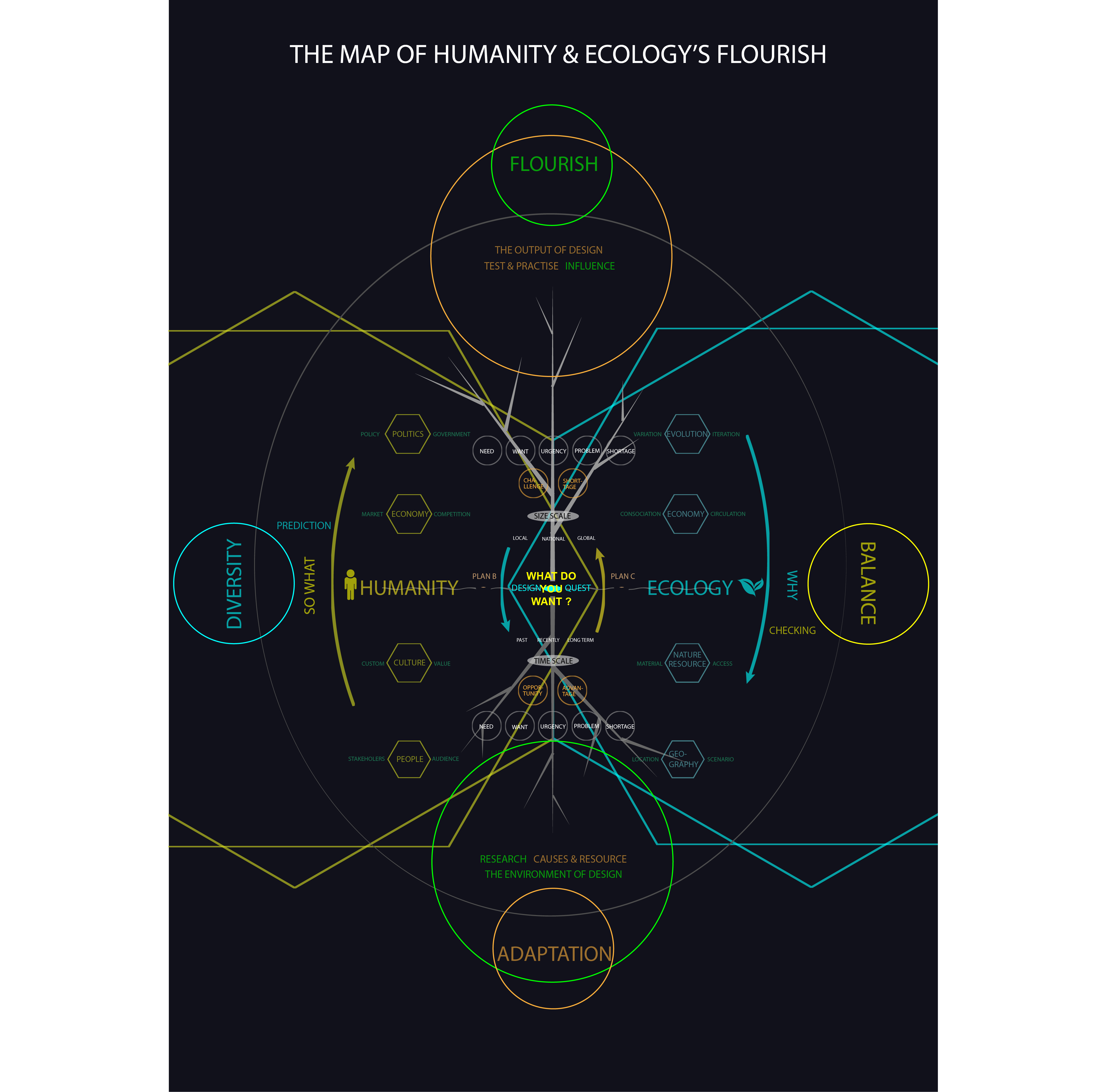
When we keep running rapidly, sometimes we should slow down and look back towards the point where we started, especially while we can see there’re full of dangers ahead that feel not like what we expected before. Maybe we can think about changing our direction to correct it and question ourselves, what if our destination, is in the opposite way?

The RETURN project so far includes 3 part.

  1. The methodology map.
  2. The research & practice of sustainable cleaning
  3. A plan for application in a Chinese nature reserve and community

The methodology map

sustainability map 
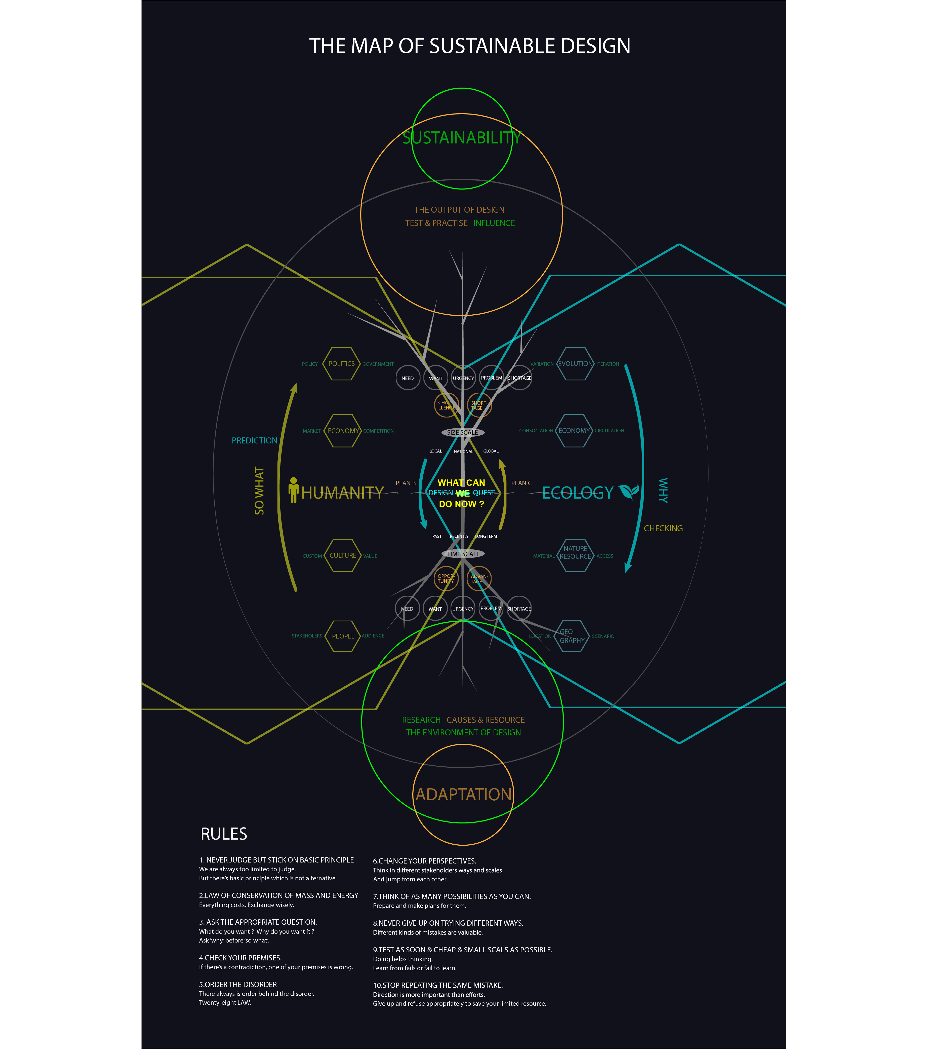
I will explain it by answering the following questions:

  1. How to be sustainable? Plant a tree

  2. What do you want to sustain? Choose a seed

  3. Why flourish? For happiness

  4. How to flourish? Diversity & balance

  5. Conclusion Mission

1. How to be sustainable?

tree

  • 1.1 The Environment of Design
  • 1.2 Ecology System
  • 1.3 Humanity System
  • 1.4 Why & So what
  • 1.5 Time & Size Scales
  • 1.6 Finding advantages
  • 1.7 What can we do now?
  • 1.8 Finding shortages
  • 1.9 Testing prototypes
  • 1.10 Ten rules

1.1 The Environment of Design

adapt

In different environments grow different kinds of trees. Each design is run by people for the audience, at some place and some time. They’re the 5W questions of design – who, where, when, what and why. In order to let our design survive, it’s worthy to spend a lot on the previous research and make decisions according to the facts and the available recourses we find, as much as we can.

1.2 Ecology System adapt

Geography decides what kinds of natural resources there are and nature will use them economically. All the systems are combined and share the materials. They run in loops to let the limited materials sustain. What’s more, there’re the variation and iteration to keep improving the changeable systems. If designs exist in this physical world, they have to take some materials and turn into something for designers’ reasons.

1.3 Humanity System humanity

People’s mind is the foundation of our system. Our bodies are born from nature so the rules of Ecology system work on us as well and there’s no big difference.

In artificial designs, we work with stakeholders for our audiences whom we choose. And we make design decisions according to our values or audiences’ willings from cultures. The economy is also about making decisions, for we have limited resources but endless needs and wants. So you always have to give up something for gaining something else. Competitive markets make choices for us. As Marxist said, ‘ Base and superstructure’, politics influence our designs very much. We should know and understand the policy and search for useful resources for us. Governments are surely included in our stakeholders.

1.4 Why & So what why&so what

At this step, we have found pieces of facts through a large amount of work on research, but not enough. With these disordered information, we need to connect and order them by asking ‘why’ and ‘so what’. And asking a few times is not enough as well. It’s very annoying, uncomfortable, painful and cruel, but we have to repeat the 2 questions endlessly. Because you will find every time you get different answers and it’s hard to tell what are appropriate truly. In addition, ask ‘why’ before ‘so what’. It’s very easy that we jump into designing the solution of problems instead of understanding how they were caused. Your solutions might work for a while but lose function quickly because they don’t touch ‘nature’.

1.5 Time & Size Scales scale 
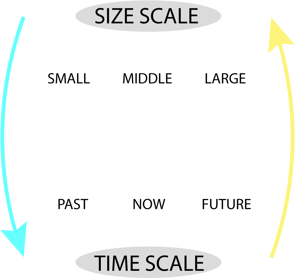
Asking in different kinds of scales of time and sizes can help us view things from all angles. In time, the history of the object is very important. Because things usually happen in circulations so it might already happen before. It will save us a lot if we spend enough on the previous. But the solution worked before doesn’t mean it will work for now and the future. That can be our reference but of course, we can not just copy it. We usually follow the traditional ways and expect them to solve the changeable problems. In sizes, different scales of designs need different volumes of resource and impact with different degrees.

1.6 Finding advantages opportunity There’re problems everywhere and all the time. For most situations, we can do nothing at all. It’s great to realize don’t try to tackle something when we don’t have the ability to. Just do your part, as best as you can. But changing small things with our limited capacity can also make a difference, especially if they’re the keys. We have to keep positive among those disappointing facts and design hopes and win-win.

1.7 What can we do now? design question

Now we can decide what we can design by answering the 5W questions after great efforts on research,finally. But as you can see, we are just at the halfway point, but it’s the beginning of our influence to the world. Next, we need to be more brave yet careful for we’re going to gain and lose physically in this material world of conservation, by action research.

1.8 Finding shortages challenge When we are very optimistic about how we are going to change the world and save the planet, it’s time to hold on and reflect the challenges hiding behind the opportunities we chose. To calculate the risks, costs, and effects in different time and size scales as well as on different people. The reflection can protect others and us.

1.9 Testing prototypes test In order to make a difference, we have to take risks and pay for it, but we can make more appropriate choices after reflection ,or still can’t. In case hurting others and ourselves, we can make a small step first, quickly and easily. Then to walk step by step until we can run. If we fall, we can have a rest to think about it and then get up again while correcting our direction from time to time by GPS, just in case you are running into the wrong way by a slight deviation in the beginning. Only after we practicing the knowledge we learnt, we will see things are often different from our common senses and cognition. Sometimes they may prove our hard-working research is totally wrong.It is frustrating, but it doesn’t mean to be meaningless. That’s also an efficient way of learning. Our designs may change completely in the future, in functions or efficiency. They can be far out of our expects when it spread furtherly. 
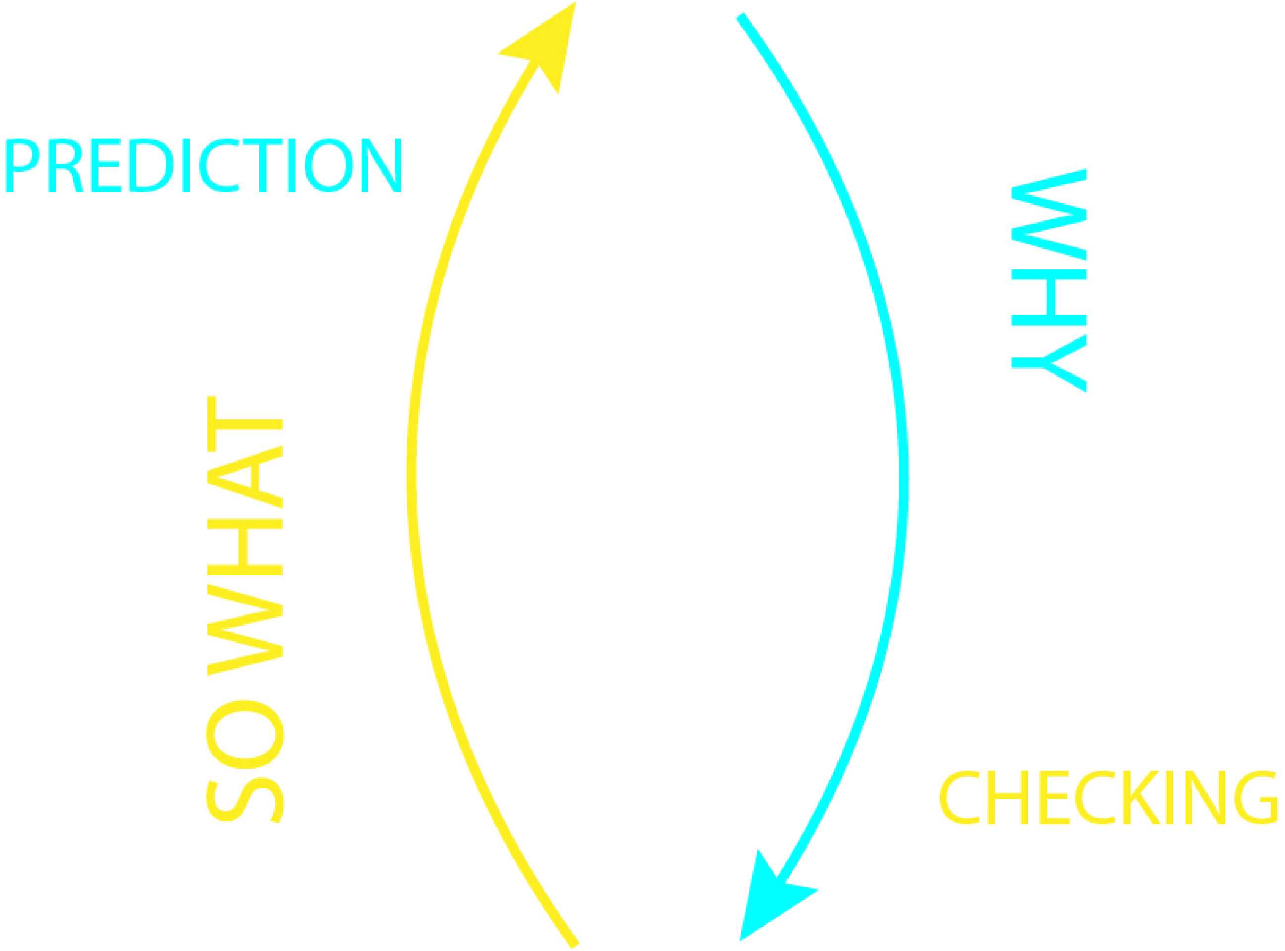
Then we can keep questioning ‘why’ and ‘so what’ about them, and start another loop.

1.10 Ten rules

The 10 suggestions are also combined with each other and we need to apply them all at the same time.

rules

The whole process is complex, tough and cruel. Therefore nothing comes easily. Every existence is a unique miracle already. Yet if we want to do something good, it’s far not enough .


‘There’s nothing new under the sun.’

The methodology already used widely everywhere. I just illustrated and explain it as a designer in my way, but everyone is a designer because we all want to sustain something. Fortune, fame, power, relationship, life….

I think the business uses it first and has done very well, especially the internet companies. That’s why they can make popular products that are so easy for users and satisfy them so much that they can not refuse them. And those designers are proud of what they have done by saying ‘ We create needs. That’s a real innovation. ‘ That’s how they make money from utilizing nature and humanity. They built a whole enormous and cumbersome system to support it depending on the natural resource that looks like endless, exploiting loopholes and sending people to involve, by designing things that should be known invisible and educating us in their ways.

There’s a Goebbels effect. It means when you repeat the fake thousands of times, then they become, the ‘ truth ‘.

In their way, things run kind of well in those systems but there’s fear all the time, for it’s clearly unsustainable. For it’s opposite from nature’s direction. Therefore, the methodology map is just a tool and way. To use it in what directions depends on you.

2. What do you want to sustain?

So the key question should be,

What do you want?

Why do you want it?

Is it really the reason for it?

Do you really benefit from it, eventually?

Are you sure the people you want to help really benefit from your designs, finally? (Usually, we think we’re doing good to others or ourselves but actually not. )

What on earth do you want?

What kind of environment do you want to adapt to?

You have to spend a lot on these questions if you really want something. For you know, what kind of seed you plant decides what you’re going to gain in the harvest. The destination decides the direction. The same people will meet and help each other towards the same destination even they come from different places.

Therefore, who do you want to work with?

Where do you want to go?

3. Why flourish?

We always feel our behaviors are 100% reasonable and there’s nothing to doubt about ourselves. That’s true because we do things for reasons and everything is caused by something to happen. So our reasons for doing things, I feel, eventually, just for,

Happiness.

That’s what we want. And we want it right now, very much. So my answer to why I want to design flourish is very simple.

Because I feel happy!

And it turns out I am living happily by doing it!

I believe that’s also the answer of those who are living in unsustainable ways. We have the same answer because humanity never changes. We are all human beings. But I’m sure there’s a difference between our happiness.

We have different values on what is happiness. In my opinion, there’re 2 kinds of happiness.

One is from the brain.

It’s made by our physiological sense so that it’s short, limited, feels real and we can control it by physical ways, for scientists can see it through microscopes. So we need to eat and feels happy when eating, but if we eat too much we’ll get sick. Some people keep taking drugs, shopping and searching for excitement from outside to sustain it. But we should sleep when we are sleepy instead of drinking coffee. And actually, we don’t need too much sleep and food, just take what we need.

Another one is from the heart.

We feel happy when close to beautiful nature, naturally, and from the bottom of our hearts. It lasts long and limitless. For we know psychological factor always influence much more than the physical one. It feels very real as well, especially when we’re heartbroken. We can also control it by getting close to or away from the truly beautiful things.

4. How to flourish?

fourish map

The key to be flourishing is diversity and balance. The opposite way is singularity and lopsidedness.

To keep diversity, we should not judge the difference and unknown before we know them. In order to protect ourselves, we can keep enough distance with each other, just like sharp deers. But we can try to know and understand them by communicating and sharing instead of criticism and fight without knowledge.

In design, hearing different views, view things from different angles, thinking different possibilities, preparing different plans, work with differnt people, researching and testing in different ways, making different mistakes … so that you can make a difference.

5. Conclusion

Since this class is called Sustainable Graphic Design, my conclusion about what the mission of graphic designers is —

As visual designers, to visualize the invisible.

Show them, so that people can realize.

trees

Enjoy the difficulties, if you figure out what you really want after answering all the questions and trying everything, including giving up. No one can promise that the way you choose will be easy or right, for you.

Just imagine you’re playing a game. If the game is too easy you’ll lose interest. But I’m sure you will gain what you plant with your heart if you deserve it.


Reference:

Sustainable Cosmetics

Risa Benedyk

My project originally was to create a theoretical makeup brand that prioritized sustainablity. My original goals for this makeup line were that it:

  1. Used natural/minimal/non-toxic products
  2. Was cruelty free
  3. used reduced-waste packaging

From looking at other brands, I considered the specifics:

-square packaging for stackability

-bamboo casings

-vegetable-based inks

-biodegradable cardboard packaging

-natural/minimal ingredients

-fruit pigment?

-ethical pigment sourcing

-refills

I started designing a logo. It was based on a brand called “Elate” that used bamboo casings for its products. I called it Uplift,and it was going to be a knock-off, slightly-better verson of Elate. Eventually, I decided I was wasting time designing a whole new logo for a brand that didn’t even extist; I starting thinking about how to make the bamboo idea more sustainable, or even find alternatives.

My thoughts jumped to “recycling.” I found makeup containers made of biodegradable cardboard.

https://www.etsy.com/listing/287475895/eco-eco-friendly-packaging-lip-balm?ga_order=most_relevant&ga_search_type=all&ga_view_type=gallery&ga_search_query=biodegradable+packaging&ref=sr_gallery-1-2&organic_search_click=1&frs=1

Makeup with “natural” ingredients tend to expire faster because of less chemical preservatives in the product. This was pointed out, and the idea was proposed to find containers that broke-down soon after the products started to expire. I found Tomorrow Machine, a studio that created sugar-packaging for food products.1 The sugar packaging would slowly break-down, creating essentially no waste while effectively protecting the product.

https://www.itsnicethat.com/articles/tomorrow-machine

After all this brainstorming I stumbled across actual brands that value sustainablity and live up to this claim.

https://www.burtsbees.com/ Burt’s Bees

https://www.aveda.com/ Aveda

I also found Seed Phytonutrients.2 They use 70% less plastic than a traditional bottle. And their produtcs are wrapped in a compostable shell. There is a seed packet inside that you can plant when you are done with the bottle. Finally, there is the pump left. You can send it back to them for them to re-use. Essentially, the product is contained in a hard plastic bag, with a shaped, compostable outer shell to protect. They have hair/body products but no makeup. Unfortunately, their prices are on the higher end. For example, their Hair and Body Oil is $42 for a 2oz bottle.

https://www.instagram.com/seedphytonutrients/

However, what I didn’t consider the specifics of were: an inclusive shade-range, affordable pricing/budgeting to sustain a sustainable brand, ingredient sourcing, the fact that powders have a longer shelf life than wet/cream products and how this might factor into brand sustainablity.

A potential conclusion of this project is that the cosmetics industry as a whole should be done away with. There might be an exception for moisturizers and oils. However, they are medically relevant; our skin is an organ. We don’t even need shampoo. We can just use soap.

Whether or not cosmetic products are sustainable, is the mentality behind the industry sustainable for our well-being? We are constantly chasing after new trends. We anxiously slather on anti-aging products, but everyone ages; we know this. The pressure never ends, to achieve the latest “attractive” look, to buy the latest big-name brand - Kyle Jenner, MAC, NARS. And all the way, material waste is generated. Of course, it is complicated. I started this project because I enjoy putting on makeup. I enjoy buying it too - I feel like a part of the makeup community. I wonder if I still identify that way, knowing that it damages the world around us.

It is not solely the consumer as an individual, the store that sells the makeup, the companies that tell and give consumers what they want to buy. The pressure that makes us feel bad, the colors that make us feel good. What compels people to buy makeup is all these things and more. If we abolished the amount of physical waste that plagues the product industry, along with the attitudes that people have to look a certain way, my conflict towards the makeup industry would dissapear. But in the end, stores, ads, and expectations are still there.

Designers Working Towards Sustainable Practices

Claire Evans

The Canary Project

http://canary-project.org/

Who They Are

Started by Susannah Sayler and Edward Morris, this team produces art and media specializing in ecological issues around the world. In many cases they are responsible for the specifically the logistics of these artistic works including documentation, publicity, editing, organizing, research, studio space, volunteers, etc.

What They Do Differently

They create works for this cause alone ranging from climate change, species extinction, and food and water resources. For their projects they work collaboratively with artists, designers, scientists, writers, and volunteers.

alt text alt text

Project Example

High Water Line: A public artwork in NYC that marked the water line of 10 feet above-sea level across 70 miles of New York City’s waterfront in order to show the effect of climate change. The marks represent how much flooding could take place if climate change continues. Eve Mosher walked the 70 miles and was able to talk to people along the way about climate change, spreading information in that way.

Futerra

https://www.wearefuterra.com/

Who They Are

Futerra is a sustainability consultancy agency working simultaneously as a creative agency. They work with clients that are promoting sustainably positive change. They started in the UK and have branched out to locations in Stockholm, New York, and Mexico.

What They Do Differently

They are majority owned and led by a group of women, and they are one the United Kingdom’s first B-Corporation, which essentially means an ethical business that, “commit to hitting social and environmental goals, alongside financial ones” (https://www.businessinsider.com/b-corporation-uk-2015-9
http://futerra.alchemy.digital/about/)

They created a “Selling Sustainability” open-source guide for businesses that explains the importance of moving towards sustainability, what the challenges are in branding sustainability, and how you can overcome them. They even have a section on how to avoid “Greenwashing,” or over-glamorizing their “eco-friendly” product that may only have one sustainable attribute such as using less ink on the packaging and calling yourself sustainable.

a man in a wet suit next to a small motor boat on a lake with the caption, "my wild life." an excited young boy on a rock in a lake holding a crab with the caption, "my show and tell." a smiling young woman next to a canal holding a trash bag with the caption, "my city break."

Project Example

The Wildlife Trusts: This charity, The Wildlife Trusts, has 800,000 members dedicated to save the existing nature in the United Kingdom. They decided to hold a campaign to make more people in the UK understand the importance and value of nature in the nation. The Futerra design group created a campaign website, short-films, workshops, and print and social media designs. They created a series of images of people a part of the Wildlife trust who regularly enjoy nature and the activities they do in nature, emphasizing the importance of nature in their lives. The slogan used throughout was “my wildlife,” and filling in the wildlife with catchphrases related to their activity. They received 200,000 views on their videos, 27,000 new members that will help to contribute more funds, and 325,000 sessions on their website. This campaign helped to initiate more care and awareness on the nature that is left in their nation, and strived to change people’s attitudes towards it. I am unsure if their design practices in the process strived to make sustainable choices such as using nontoxic inks; however, this work and the rest of their work campaigns people for more environmental sustainability awareness and understanding in people’s everyday lives.

La Page Original

http://lapageoriginal.com/ca/nosaltres/

Who They Are

A visual communication studio that began in 1991 and specialize in social communication with institutions and businesses alike. They focus on creativity, community effectiveness, responsibility, quality, and sustainability. They work on a range of types of projects including communication plans, corporate images and branding, editorial design, produce catalogs, global production process, and web projects.

What They Do Differently

They focus on the full life cycle of every product they make, and they place close attention to any waste created. They use a 5 step plan to make sure that they are being as sustainable as possible. 1. End life: they work to use recycled materials or use materials that are completely recyclable. 2: Usability and user experience: in what ways can they reduce resources and achieve their end goal. 3. Profile producing companies: using production companies that use environmentally safe processes. 4. Edo-design strategies: making design decisions that have less impact such as material choice, waste decreasing forms, inks, and how things join or finish (not using something like glue which makes the material unrecyclable at the end). 5. Change agents: designing to promote more sustainable behaviors from the consumers or clients.

Project Example

an upright calendar with a large, black hexagonal printed pattern 
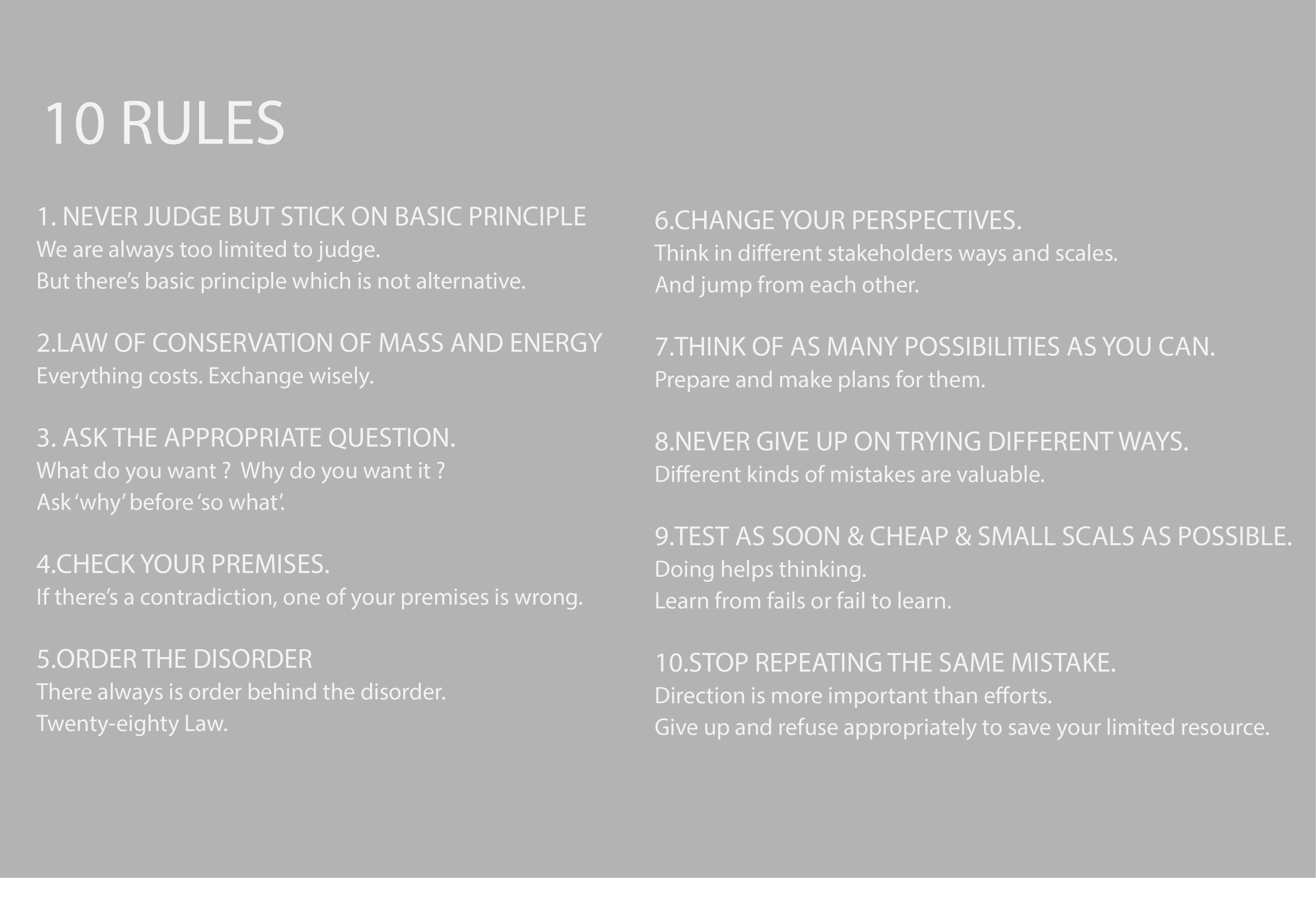
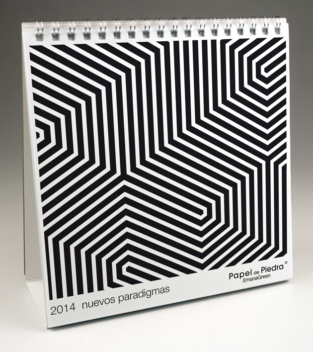
Stone-Paper: They launched an experiment to print a calendar on paper made of stone. Calendar’s only last one year until you have to buy another one, so they wanted a paper that would be able to biodegrade with that lifespan in mind. What they found was that the stone paper left in the studio remained in good condition and intact after a year. They left other sheets outside to be affected by rain, weather, heat, cold, etc for one year. The paper left outside overtime broke down and crumpled as if it were plaster and was then able to degrade. The production of stone paper releases 50% less carbon dioxide than tree paper. The downside was that the production time was slower (although is this really a downside in the sense of sustainability?). In addition, it required no water or toxic chemicals to produce, unlike tree paper. Interestingly, the paper responded the same way to inks as tree paper. They were even able to play with a transparency effect with the paper because they used a thin layer. The binding for the calendar was made of 100% recyclable aluminum, and they did not use full-bleed to minimize ink.

Project Example

alt text Squid Ink: La Page Original held a workshop with students from Pau Gargallo School with ecodesign as their focus. They were tasked with creating a product that would liven their city while being sustainable at the same time. They decided screen print a graphic with the recipe to a famous dish in their local town. They worked with squid ink, a safe ink that is edible but was difficult to work with. They were successful with their project however.

Modern Species LLC.

https://modernspecies.com/

Who They Are

A branding design group that works with companies who have environmental missions to push their clients to do better for the environment, economy, and society while also creating unique and custom brands. They accentuate that they are not Utopians, and instead embrace the practical nature of the world we live in and realize brand identity and certain market standards are important. Their website is also beautifully designed.

What They Do Differently

They work to be a sustainable company not just for their clients, but also in their work space. They use low-VOC furniture, are wind-powered, compost and recycle, as well as accentuate a healthy working experience for their employers (health insurance, flexible schedule, paid leave, and fair wages)

They create sustainability reports for their clients, allowing there to be transparency for consumers, and giving the companies a tangible understanding and feeling of change. They also acknowledge the entire lifespan of the products they create and work to

an image scan of an open book with environmental statistics an image scan of an open book with Organic Valley's vision for sustainability mission image scan of open book with ways Organic Valley is sustainable on their farm

Project Example

Sustainability Report for Organic Valley Farms: They created a magazine brochure to release their sustainability report and created their campaign graphics and sales representation and handout. Thought the final product does not look different from other design projects, they were able to save 2,093 pounds of greenhouse gases by using post-consumer recycled paper. They saved 40-60% of the end project’s budget by designing the content to fit the press sheets and having a cover with the same paper as the book’s content. They used vegetable based UV inks that are low-VOC, and the paper used was certified by the Forest, Stewardship Counsel. The remarkable thing about this project is that they achieved all of these goals without the final product looking any different from other designs that meet none of these sustainability standards. It is up to us to care and make it happen.

Renourish

https://re-nourish.org/

Who They Are

An Australia based non-profit organization that advocated for more sustainable graphic design practices. They provide tools such as a project calculator which allows you to input all the your project specifications and calculates waste created and then informs ways in which you can reduce your waste for your project.

What They Do Differently

Published a book called Design to Renourish, written by Eric Benson and Yvette Perullo. It is a book written for graphic designers that, “helps to integrate sustainability into their workflow through design process called systems thinking. This process asks the graphic designer to approach a design problem by being more informed and aware of and influenced by the impacts that materials and vendor choices have on one another, the planet, and consequently on us” (https://re-nourish.org/design-to-renourish/).

Project Example

boxes and cards on a table with colored bird patterned paper 
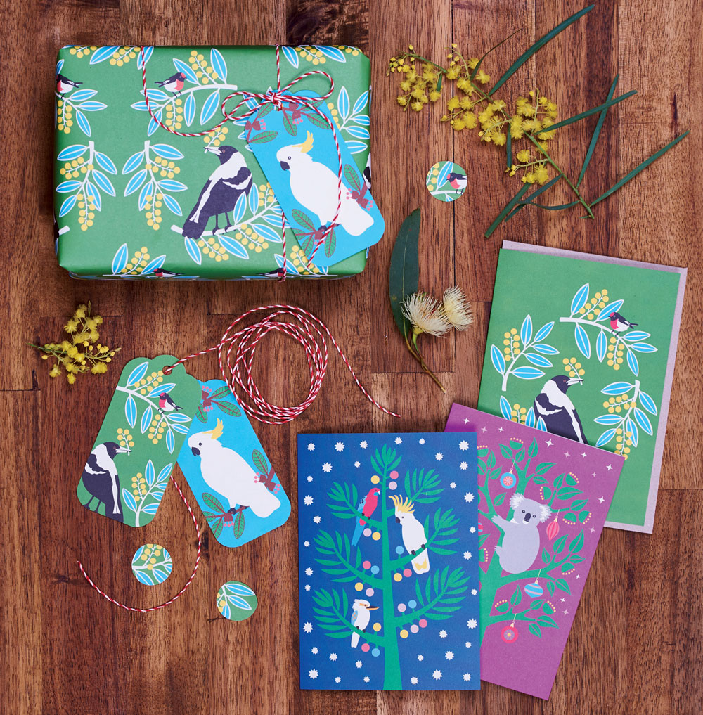
Renourish designed sustainable greeting cards that would benefit the non-profit organization, Trees for Life, in Australia that works to plant native trees. For this project they used 100% post-consumer recycled paper for both the cards and the envelopes. The envelopes were also unbleached. They used vegetable based inks, used digital to plate printing and worked to decrease water consumption. They designed the packaging to show the card designs through a cut-out window, eliminating the use of plastic. They worked have the project carbon neutral by offsetting the amount of greenhouse gas emissions produced with Green power. Through their efforts, they were able to donate enough money to Trees for Life to plant over 40,000 trees.

The Ecological and Ethical Sustainability of Music

Harley French

Music is a daily part of my life. When I’m not in class, I listen to Spotify all day long. The form that music has taken in casual American life has changed considerably in the past fifty years, from vinyls, cassettes, and CDs, to iPods, to streaming and subscription-based platforms. This semester, I found out that the music industry has a huge carbon footprint. This doesn’t mean that everyone should stop listening to their music, but we should be conscious of our personal energy usage. I encourage all music listeners to remember that in a capitalist economy, blaming corporations is far more important than blaming individuals. However, there are things that everyone can do to make the world more sustainable.

First of all, why is music so bad for the environment? Basically, all physical forms of music require energy and greenhouse gas usage to be created, and streaming music requires major amounts of energy in order to keep servers running, in order for music to always be available to listeners. A study called “The Cost of Music,”1 by the University of Oslo and the University of Glasgow, found that streaming is actually worse for the environment than anything before it, including non-biodegradable vinyl records, and people will only pay a fraction of what they used to for music. Dr. Kevin Devine, the University of Oslo professor who led research on the ecological sustainability of music consumption, told Global News, “From a carbon emissions perspective, the transition towards streaming recorded music from internet-connected devices has resulted in significantly higher carbon emissions than at any previous point in the history of music.”2 While the physical production of music formats has gone down, the greenhouse gas and overall energy usage has gone up.

As a constant Spotify-user, this is extremely concerning. I know many people use Spotify as much as I do, and there are definitely ways to conserve your energy usage while listening to the music you love. Live music and physical copies of music are both methods to avoid streaming all the time.

These are both better for musicians economically, as well!

Pitchfork’s article3 on the Cost of Music study says it best, “In 1997, consumers were willing to pay roughly 4.83% of an average weekly salary. That percentage decreased to roughly 1.22% of an average weekly salary in 2013. Since the advent of streaming, the research shows that consumers now pay only just over 1% of their weekly salary to listen to a vast library of music.” This means that everyone, from the major pop stars to small DIY bands, are being paid less for their actual recordings.

To make sure your favorite artists are getting the money they deserve, spend your money in other ways: buy merchandise and go to shows. Dell Furano, who has been in the merchandise business for over 40 years, said in an interview with Billboard, “For touring artists, their main revenue still comes from touring. But they make very substantial merchandise money. It’ll range from 10 to 35 percent of their revenue.”4 So, musicians make most of their money from touring and selling merchandise, which, while not always ecologically sustainable, is the most economically sustainable way to support your favorite bands.5

Bandsintown is a fantastic app for discovering shows for bigger artists that you’re tracking on Spotify, but I would also suggest to support your local scene! Search on Facebook for gigs, and follow the venues closest to you. At MICA, the Windup Space, Metro Gallery, and the Crown are all within walking distance; Ottobar is within the bounds of the shuttle, and Sidebar, Soundstage, and Ram’s Head are all short bus rides away!

On a daily basis, streaming is not ethically wrong, even though there’s more you can do. NPR, when asked if “using Spotify makes you a bad person,”6 first replied that it is better than illegally torrenting or downloading music. It’s also a great way to find new music, but if you already love the artist, consider buying their music. Then they wrote, “From there, dig into the tremendous array of ways to sustain the livelihood of musicians whose work sustains you. Contribute to their Kickstarter campaigns if they exist. Go to their concerts and encourage your friends to join you — and, while you’re there, buy a T-shirt or music directly from the band itself. Champion the music you love on social media; that word of mouth means a lot, both financially and for morale.” If you support musicians ethically, by going to shows and buying physical copies, you’ll have less of a carbon footprint than only streaming constantly. Vinyl records, though they are part of petrocapitalism (fossil fuel industries), are actually better for the environment than streaming, according to the Cost of Music study. Cassettes are great too, and are also making a comeback with DIY and smaller bands. Buying physical music is also within easy distance of MICA: True Vine and Baby’s On Fire both sell records and are walkable and within the MICA shuttle boundaries.

In our Sustainable Graphic Design course, we’ve repeatedly discussed that the most ecological way to design is not at all, and that the most ecological way to exist is the same: Everything we do has an impact on the environment. Sometimes we need to zoom out and see the bigger picture: All day long, all we do is consume. Music, resources, food, everything. And capitalism encourages us to consume as much as we can. I currently do listen to music constantly, so I understand if this is hard to imagine, but maybe I can embrace the natural sounds of the world. Maybe, someone like me, who listens almost all the time, can spend a little less time filling my head with noise, or focus more on making my own music!

Ultimately, being conscious of yourself and your energy usage is an important first step to making the world a more sustainable and safe place to be. The more self-aware you are, the less likely you are to be harming the world.

sources: https://www.gla.ac.uk/media/media_643298_en.pdf https://globalnews.ca/news/5150481/streaming-music-bad-environment/ https://pitchfork.com/news/emissions-from-music-consumption-reach-unprecedented-high-study-shows/ https://www.billboard.com/articles/news/magazine-feature/7800218/dell-furano-concert-tees-40-years https://tonedeaf.thebrag.com/just-how-much-do-artists-earn-from-merch-these-days/ https://www.npr.org/sections/allsongs/2013/09/26/226468333/the-good-listener-does-using-spotify-make-you-a-bad-person https://jhenrypenrose.com/the-sustainability-of-music-streaming http://dailytrojan.com/2019/04/21/from-the-soundboard-the-music-industry-must-embrace-ecological-concerns/

  1. https://www.gla.ac.uk/media/media_643298_en.pdf 

  2. https://globalnews.ca/news/5150481/streaming-music-bad-environment/ 

  3. https://pitchfork.com/news/emissions-from-music-consumption-reach-unprecedented-high-study-shows/ 

  4. https://www.billboard.com/articles/news/magazine-feature/7800218/dell-furano-concert-tees-40-years 

  5. https://tonedeaf.thebrag.com/just-how-much-do-artists-earn-from-merch-these-days/ 

  6. https://www.npr.org/sections/allsongs/2013/09/26/226468333/the-good-listener-does-using-spotify-make-you-a-bad-person 

Bibliography/Resources

Resources

Readings

Required Class Readings

Reading 1: Waste = Food

  • Waste Equals Food. from Cradle to Cradle, by Michael Braungart and William McDonough
  • Disposability, Graphic Design, Style, and Waste. by Karrie Jacobs

Reading 2: A Mindset

  • Sustainability Means Nothing Without an End in Site. from Flourishing by John Ehrenfeld and Andrew Hoffman
  • Design and the Welfare of All Life. by Bruce Mau
  • What is Attitudinal Design. by Alice Rawsthorn

Reading 3: Some Background

Reading 4: Multitudinous Methods

Reading 5: Luxury and Craft

Reading 6: Digital and Physical Applications

Reading 7: Reframing Outcomes?

  • make your own mascara: https://www.youtube.com/watch?v=wRdmsWoO95Y , https://www.youtube.com/watch?v=-12VtQ4W6Io
  • make your own ink: https://www.wikihow.com/Make-Ink-from-Tea
  • make your own paper: https://www.paperslurry.com/2014/05/19/how-to-make-handmade-paper-from-recycled-materials/
  • Waste and Want: A Social History of Trash by Susan Strasser
  • Manifesto for Maintenance Art by Mierle Laderman Ukeles

Resources

General info, websites, podcasts, etc. that are worth keeping up with or relying upon to help with information gathering, learning, understanding, whatever.

https://www.ted.com/talks/greta_thunberg_the_disarming_case_to_act_right_now_on_climate https://www.un.org/sustainabledevelopment/sustainable-development-goals/ https://re-nourish.org https://plasticsrecycling.org/apr-design-guide/apr-design-guide-home http://dothegreenthing.com https://solar.lowtechmagazine.com https://www.vice.com/en_uk/topic/oh-ffs

Fonts

  • https://www.colophon-foundry.org